1. Why Org Charts Actually Matter
An org chart is not just a corporate formality. It helps people understand where they fit, who to contact, and how work flows through the organization. It is most useful when it answers two questions: who reports to whom, and who can help me?
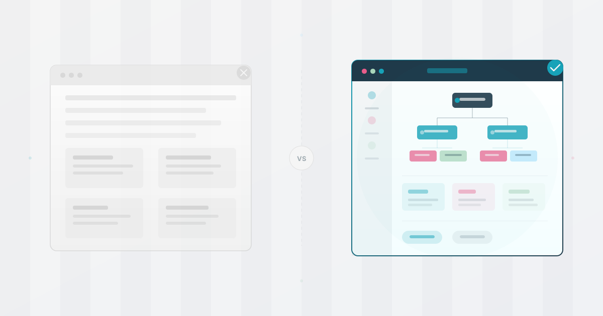
That is why a useful chart needs more than polished boxes. It needs accurate people data, a clear audience, and a maintenance workflow that keeps it trustworthy. For a clear-eyed look at why traditional static org charts fail, start there.
When employees can find the right team or colleague without asking around, the chart becomes part of everyday work rather than an annual HR document. See what makes a great org chart before choosing a format or tool.
2. The 5 Most Common Org Chart Mistakes
- Treating it as a one-time project. Companies build an org chart once, then let it go stale. In a growing company, people join, leave, and change teams constantly. If updates are not part of the normal people-data workflow, employees learn not to trust the chart.
- Only showing hierarchy. Names and reporting lines answer one important question, but employees also need to find expertise, projects, locations, and team context.
- Designing for leadership only. A chart built only for board presentations may look polished while failing the people who need it for onboarding, collaboration, and everyday navigation.
- Using a static tool for a changing organization. PowerPoint, Visio, and spreadsheets can be appropriate for a one-off deliverable, but manual redrawing becomes expensive after every hire, departure, or reorganization.
- Making it hard to access. If the chart lives in a folder nobody opens or behind a separate login, it will not become a dependable employee resource. Make the right view easy to find and give it a clear owner.
3. How to Create an Organizational Chart: 7 Steps
Short answer: define the audience, clean the employee data, validate manager relationships, choose the right format, review the first version, set permissions, and assign an owner for updates.
- 1. Define the purpose and audience. Decide whether the chart is for onboarding, employee lookup, leadership planning, or a one-off presentation. One source can support several views, but each view should have a clear job.
- 2. Start with a clean employee data source. Use one row per person and keep stable fields such as employee ID, name, title, department, and manager ID. If the data starts in Excel or Google Sheets, clean it before importing.
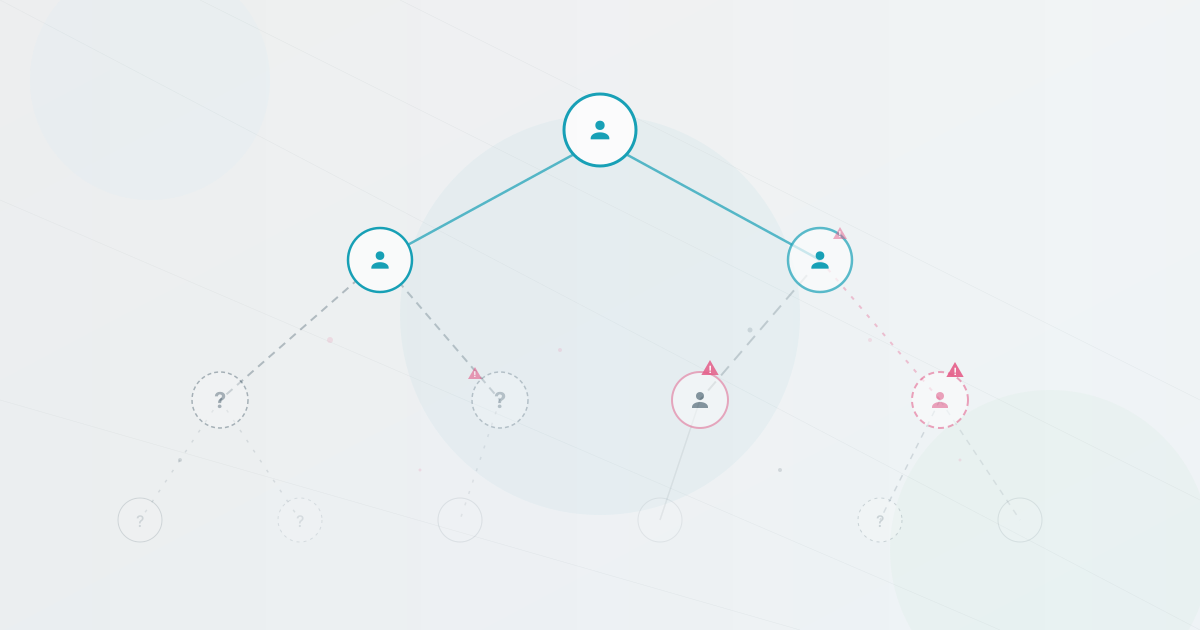
- 3. Validate manager relationships. Check that every manager ID points to an existing person, that there is one root person or approved top-level structure, and that no one is accidentally assigned to themselves.
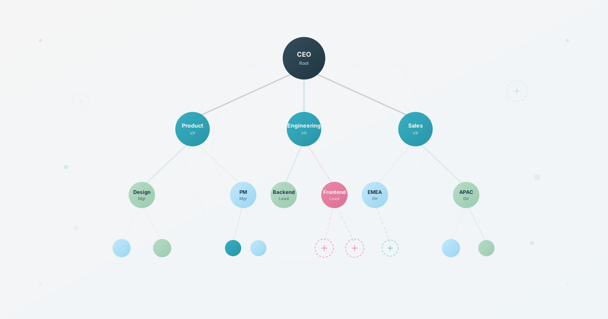
- 4. Choose the right chart format. Use a traditional hierarchy when reporting lines are the priority. Add department, location, skills, or project views when people need to discover expertise or collaborate across teams.
- 5. Build the reporting view. Create the first version from the source data, then review the branches with department leads. Check names, titles, manager relationships, and empty or duplicate records before sharing.
- 6. Review exceptions and permissions. Decide what employees, managers, leadership, and external audiences should see. Remove sensitive fields from broad views and keep private data out of public exports.
- 7. Publish and assign an owner. Give the chart a visible home, name the person responsible for updates, and set a review trigger for hires, departures, manager changes, and reorganizations.
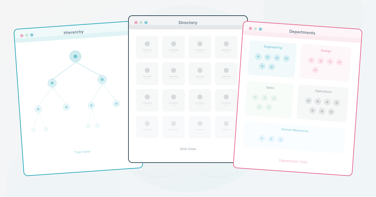
Start with a reporting view, then add the views people actually need. For example, different org chart views can serve employees, managers, and leadership from the same underlying data. Use the Org Chart Scorecard to identify the weakest part of your current setup.
4. Create an Org Chart from Excel or Google Sheets
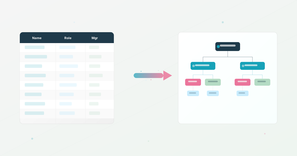
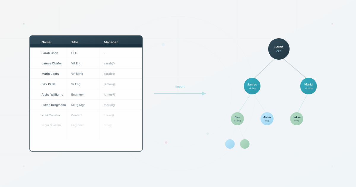
If your employee data already lives in Excel or Google Sheets, do not redraw every person as a box. Treat the spreadsheet as the source and make the reporting relationships explicit before importing it into an org chart tool.
A practical minimum dataset looks like this:
employee_id,name,title,department,manager_idOrg chart data example
Use one row per person and connect the reporting line with a stable manager ID. This keeps the structure reviewable before you turn it into boxes:
| employee_id | name | title | department | manager_id |
|---|---|---|---|---|
| EMP-001 | Alex Morgan | Chief Executive Officer | Leadership | none |
| EMP-002 | Jordan Lee | VP Engineering | Engineering | EMP-001 |
| EMP-003 | Sam Rivera | Engineering Manager | Engineering | EMP-002 |
| EMP-004 | Taylor Chen | Product Manager | Product | EMP-001 |
Need a starting file? Download our free organizational chart template (CSV), replace the sample rows with your team, and keep the manager IDs consistent. The optional Team ID column should match an existing HumanMap team external ID; leave it blank if you are importing employees before creating teams.
How to create an org chart in Excel
For a one-off snapshot, use Excel's SmartArt workflow: select Insert > SmartArt > Hierarchy > Organization Chart, then enter your roles and reporting lines in the text pane. See Microsoft's official organization-chart instructions for the current steps. This is useful for a presentation, but every change still requires editing the graphic manually. For a complete Excel walkthrough, read how to create an org chart in Excel.
How to create an org chart in Google Sheets
Google Sheets needs one person per row: put the person in the first column, their manager in the second, and optional notes in the third. Select the data, insert a chart, and choose Organizational chart. Google's official guide to organizational charts documents this format. It is a practical option for a small team, but the native chart has limited profile context, search, and audience-specific sharing.
- Keep one row per employee and remove duplicate records.
- Use a stable employee ID rather than matching people by display name.
- Make every manager ID point to an existing employee, except for the top-level person or approved root structure.
- Export a clean CSV, import it, and review the chart before sharing it broadly.
Follow the full spreadsheet import workflow if you are starting from Excel or Google Sheets. For the native Google Sheets workflow, see how to create an org chart in Google Sheets. You can also use the org chart templates and resources to prepare the data before you choose a tool.
5. Choose the Right Method for Your Organization
The best method depends on how often the organization changes and what the chart needs to do after it is published:
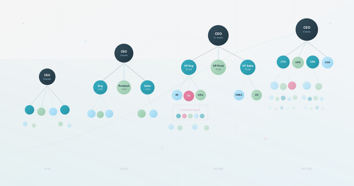
Common organizational chart types
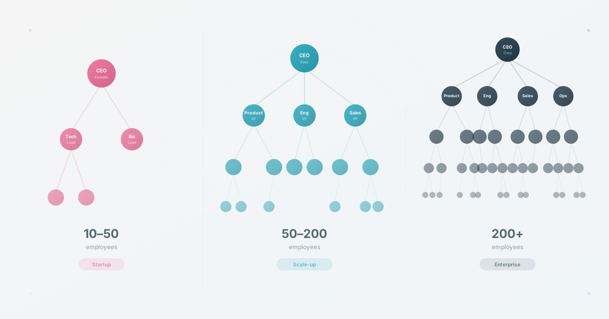
- Hierarchical: shows clear reporting lines from the top of the organization downward.
- Functional: groups people by department or discipline, which works well when responsibilities are specialized.
- Divisional: separates teams by product, region, customer segment, or business unit.
- Matrix: shows both a functional manager and project or product relationships when people work across teams.
- Flat: keeps the structure compact for small teams with few management layers.
Most HR teams should start with a hierarchical reporting view, then add functional, divisional, or matrix views only when they answer a real employee or planning question. Do not force every relationship into one crowded diagram.
| Situation | Good starting point | Watch for |
|---|---|---|
| One-off presentation or board document | Slides or a diagramming tool | Manual updates and duplicate copies |
| Small, stable team | Spreadsheet or a simple template | Whether the data will still be accurate after the next hiring round |
| Growing or frequently changing organization | Dedicated org chart software | Import quality, permissions, search, and who owns updates |
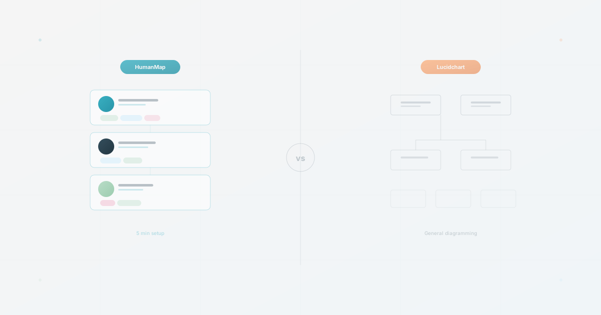
If you are evaluating products rather than building a one-off chart, use our org chart software comparison to compare setup, data freshness, employee profiles, privacy, and cost at company scale.
6. Beyond Hierarchy: The Modern Org Chart
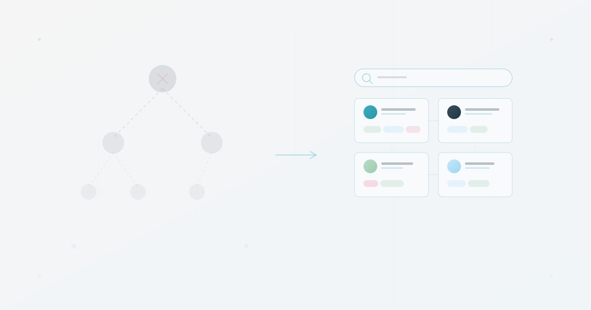
Traditional org charts answer a structural question: who reports to whom? Modern org charts can also answer a discovery question: who in this company can help me?
That shift makes the chart more useful as a people directory. Depending on your audience and privacy rules, useful context can include:
- Skills and expertise so employees can find internal specialists
- Current projects so teams can coordinate across departments
- Locations and working preferences so distributed teams know how to collaborate
- Interests and hobbies so people can build connections beyond their immediate team
The goal is not to expose every field to everyone. The goal is to make the right context findable in the right view. Read about skills mapping for HR and interest-based connection for practical examples.
7. Keeping Your Org Chart Current
The biggest reason org charts fail is maintenance. Updating the chart is rarely anyone's primary job, so it must be simple enough to happen as part of normal HR operations.
A sustainable workflow should:
- Import data directly from CSV exports or your HR system. Here is how to import from a spreadsheet in minutes.
- Let authorized people make updates without IT involvement or file redistribution.
- Reflect changes across all views so there is no second copy to maintain.
- Handle reorganizations without redrawing boxes or adjusting connector arrows.
- Give the chart a named owner and a clear review trigger for hires, departures, and manager changes.
The test is simple: when three people change teams in the same week, how long until the chart reflects that? If the answer is hours, the workflow has a chance of staying current. If the answer is “whenever HR gets to it,” the chart is already outdated. See also: the hidden cost of outdated org charts.
If you are comparing tools rather than building from scratch, read our best org chart software comparison. If you are ready to turn a clean spreadsheet into a live chart, start with HumanMap.