How to Create an Org Chart in Excel (Step-by-Step)
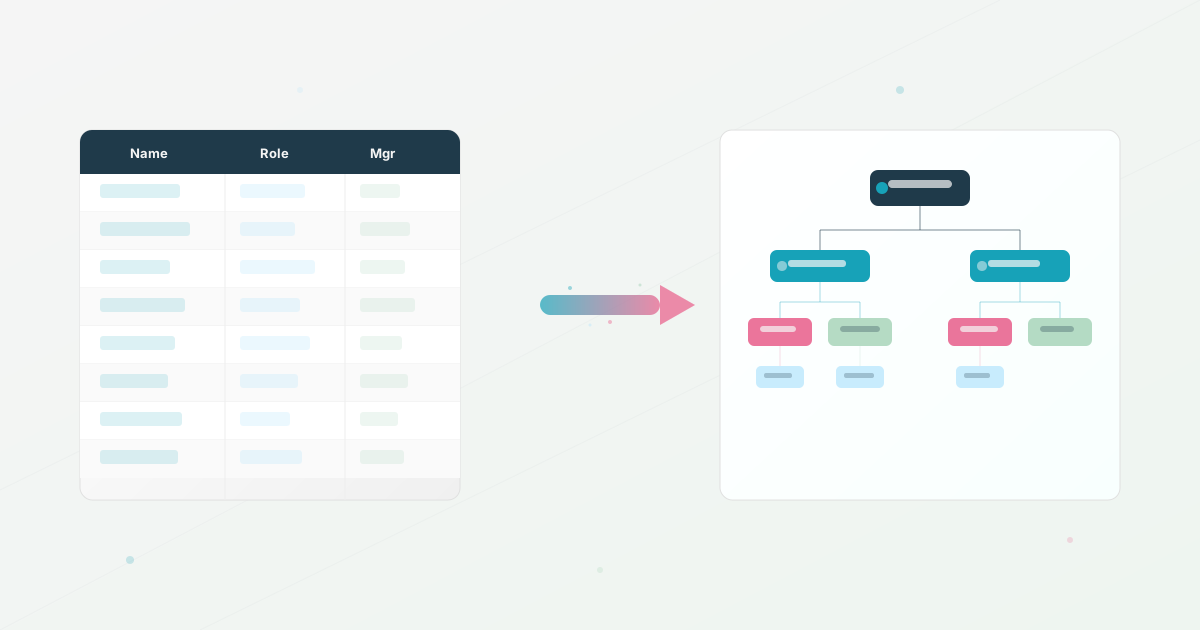
You can create an org chart in Excel with SmartArt. A direct route is Insert > SmartArt > Hierarchy > Organization Chart, followed by entering the reporting lines in the text pane.
That workflow is useful for a presentation or a small, stable team. The important decision comes before the boxes: prepare clean employee data, validate who reports to whom, and decide how the chart will be updated after the first version is shared.
If you are choosing between Excel, Google Sheets, and dedicated software, start with our seven-step guide to creating an organizational chart. This page focuses on the Excel workflow itself.
Before you start: prepare the employee data
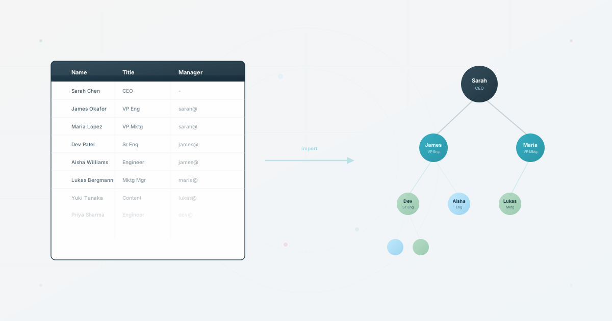
Do not begin by drawing boxes if the source data is already in an HRIS or spreadsheet. Put one person on each row and make the manager relationship explicit. A simple table like this is enough to review the structure before you format it:
| employee_id | name | title | department | manager_id |
|---|---|---|---|---|
| EMP-001 | Alex Morgan | Chief Executive Officer | Leadership | none |
| EMP-002 | Jordan Lee | VP Engineering | Engineering | EMP-001 |
| EMP-003 | Sam Rivera | Engineering Manager | Engineering | EMP-002 |
| EMP-004 | Taylor Chen | Product Manager | Product | EMP-001 |
Use stable IDs for managers rather than matching people by name. Names change, duplicates happen, and a manager ID makes a relationship easier to check. If you need a ready-made file, download the free org chart CSV template and replace the sample rows.
Before opening SmartArt, check four things:
- Every employee has a name and title.
- Every manager ID points to an existing employee, except the approved top-level person or structure.
- No employee is assigned to themselves.
- Department and title values use a consistent spelling.
1. Insert the Excel organization chart
Open a blank workbook or the sheet where you want the chart to live.
- Select Insert in the Excel ribbon.
- Choose SmartArt.
- Open Hierarchy and select Organization Chart.
- Select OK to add the chart to the worksheet.
Microsoft’s official organization-chart instructions cover the current SmartArt steps and the available hierarchy layouts.
2. Add names and reporting lines
Select the SmartArt graphic and open the text pane. Each bullet represents a box. Use Tab to make a person a subordinate of the previous level and Shift + Tab to move a person back up a level.
Enter the top-level person first, then add direct reports underneath. Keep each box concise: name on the first line and title on the second line is usually enough for a readable snapshot. If the chart is too dense, split it into department-level views instead of shrinking the text until nobody can read it.
For a small chart, editing the SmartArt text pane may be simpler than importing a data table. For a larger chart, use the table as the source of truth and review each branch against it before sharing the finished workbook.
3. Format the chart for its audience
Use the SmartArt Design and Format tabs to change the layout, colors, and shape styles. Keep the design subordinate to the information:
- Use one clear title and a readable font size.
- Keep the same role or department colors throughout the chart.
- Avoid placing sensitive information such as compensation in a broadly shared file.
- Add a date such as “Reviewed August 2026” so viewers can judge freshness.
- If the whole company does not fit on one page, create a company overview and separate department charts.
An org chart for a board presentation can be intentionally compact. An employee-facing chart needs more context and a better way to find people than scanning every branch manually.
4. Keep the Excel org chart current
SmartArt does not automatically become a live employee directory when it is created from a spreadsheet. After a hire, departure, promotion, or manager change, someone still needs to edit the chart and check that the lines and branches remain correct.
Create a small maintenance routine:
- Keep the employee table in the same workbook or in a clearly named source file.
- Record the chart owner and the date of the last review.
- Compare the chart with the source data after every organizational change.
- Keep one canonical file instead of emailing copies to different audiences.
- Remove departed employees and review access when the file is shared externally.
If the employee table is clean but the diagram is the part that keeps breaking, import the spreadsheet into an org chart tool so the visual becomes a view of the data instead of a second copy to redraw.
5. Know when Excel is no longer enough
Excel is a sensible choice when the chart is a one-off deliverable or the organization changes infrequently. Move to a dedicated org chart workflow when you see these signs:
| Signal | What it usually means |
|---|---|
| HR redraws the chart after every change | The diagram and employee data are drifting apart |
| Employees ask for search or profile context | A static picture is not enough for everyday navigation |
| Leadership, employees, and partners need different views | One workbook cannot safely serve every audience |
| Several people maintain separate copies | There is no dependable source of truth |
| The chart is always out of date | The update process is too difficult to happen during normal work |
For a small team that only needs a snapshot, keep Excel. For a growing team that needs searchable profiles, controlled sharing, and easier updates, compare the best org chart software for HR teams.
If you prefer Google’s workflow, see how to create an org chart in Google Sheets. Both spreadsheet approaches can work. The right choice is the one your team can keep accurate.
Use this today
Use Excel for a snapshot, then test its maintenance limit
Leave the exercise with a working chart and a clear trigger for changing tools.
- 01
Keep the employee data in a clean table with stable IDs before building any shapes. Save the source table separately from the visual chart.
- 02
Test three changes before publishing: add a person, move a manager, and remove a leaver. Time the edits and note which copies also need updating.
- 03
Give the file an owner, a last-reviewed date, and a location that new hires can find. Do not publish several edited copies.
- 04
Set a switch trigger, such as repeated manual updates, a need for different audiences, or employees asking questions the chart cannot answer.
Pass / fail check
Excel is still a reasonable fit when one owner can update it quickly and the chart answers the questions your audience actually has.
Questions readers ask most